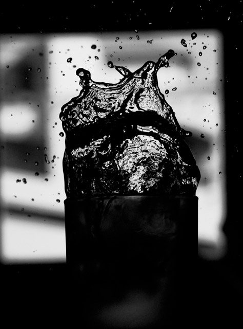
As others have pointed out, this is a nice idea. The focus is pretty good.
The composition is probably what hurt you. The image is tilted and the contrast in the window between the black and whites make it very obvious. Also the image as a whole seems off balance. I attribute this to the window framing. Your eye is naturally drawn to the whites, and they take your eye off to the left which distracts from your subject. If you were to pull back a little and frame your subject with your window, I think your photo would have a more centered direction.







 Add photograph to your favorites
 Add photographer to your favorites


 Photographer found comment helpful.


