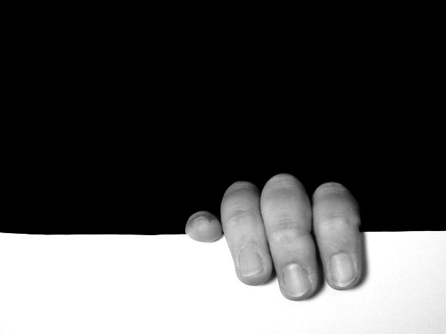
I cut out a white frame adn took a pic of my hand like i was hanging on to something. then adjusted contrast, converted to bw and cropped. Wanted it to look like hand was coming out of pic. :-)
Statistics
Place: 14 out of 218 Avg (all users): 6.6863 Avg (commenters): 7.7941 Avg (participants): 6.7793 Avg (non-participants): 6.6102 Views since voting: 2022 Votes: 322 Comments: 37 Favorites: 3 (view)
For being a set up shot, I think the leveling could be better. Ther is a very strong horizontal line, and it's making a bit of a left turn. Overall though, the photo is very nice. I do like it a lot, and the use of neg. space is clear, and very good. 8 good luck in the challenge. ~hbunch7187~
To me, this photo poses a friendly debate over which of the spaces is the negative space. It's the debate that keeps me interested, after the initial grin at this poor soul clinging to the edge. I would have preferred a perfectly even white area (the line is a tiny bit crooked), but the general composition is right on. Good lighting (maybe a bit more contrast?) and good use of negative space up top ... it weighs down on top of the fingers. 8
Interesting :) This is definitely a unique interpretation of the challenge... The focus on the fingers is a tad soft for my taste, and the flash appears to have washed out some of the finer detail in the fingers.
Very clever - really jumps out at you! I wish there was no thin grey line around our photos when they are displayed for us to judge - yours would otherwise be even more powerful, I think! - not your fault, I know! :) I do like the use of neg space here - a good example of where a single color is more effective in a negative space than a texture or other treatment.
Not only does the image use negative space to show the image, the hand comes out of negative space itself. A douple meaning negative space--gets my 10 for this alone although it is not necessarily the most pleasing image to look at.
Another of these well taken shots, good framing etc, but ultimately my feeling is: Whats the point? Theres nothing really to hold any interest, nothing really being shown to me.
Excellent!!! Nice contrast and composition (I almost detect that the 'line' is uneven - could be me). I like this very much - grrrreat work 10 Ruthann (update) Neg Space: Does it make a difference? yes








 Add photograph to your favorites
 Add photographer to your favorites

 Photographer found comment helpful.


