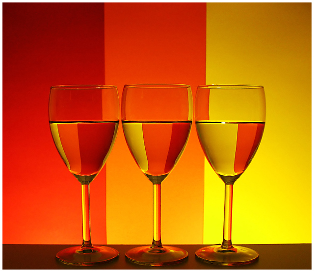
Inspired on AlexSaberi's entry for "Still Life III"
Always appreciated those glasses / refraction images, and much more now.
It's not easy to come up with a clean neat image...
I think this one has several flaws when compared with Alex's original:
- the glasses are not of good quality.
- the lighting are 2 regular lamps stolen from our computer desks.
- not to mention my PS camera and the photographer's skills ;-P
=======
Thank you for all comments and votes! Made my PB for now...
Statistics
Place: 57 out of 111 Avg (all users): 6.1242 Avg (commenters): 6.3000 Avg (participants): 5.9273 Avg (non-participants): 6.2347 Views since voting: 3097 Views during voting: 288 Votes: 153 Comments: 10 Favorites: 1 (view)
My only dislike about this(maybe I am just being nitpicky) is the curves at the bottom of the glass. I wish that, like the original, the lines were straight. But I like the lighting and the colors.
Lovely set-up and wonderful colors! Nice choice of warm colors and a fade from the red to orange to a yellow hue. The patterns of refraction in the glass are lovely to look upon. I really only have two suggestions on how to improve the visual impact of this piece. The first is that while the colors are beautiful the tones need to be a bit more vibrant - playing around with the saturation levels will increase the vibrancy of the hues and make it pop more visually. Second is the angle. It appears to me that the camera was tilted slightly down at the glasses. I think that if the base of the camera was at level with the base stem of the glasses it would give off the appearance of the glasses being more at eye level to the viewer. Of course that may have changed the pattern of the refraction but for good or bad I don't know.





 Add photograph to your favorites
 Add photographer to your favorites


 Photographer found comment helpful.


