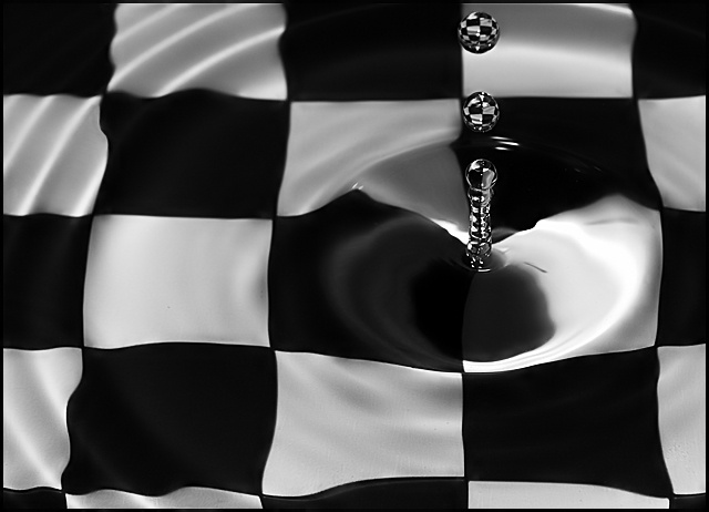
Nice capture on the water 'tower' and the details on that splash are superb! Love how the top portion of the splash drop mirror the checkerboard pattern. The only flaw with the composition is that the tones and contrasts are a bit flat. They could be bolder and more vibrant such that they pop off the page. Perhaps playing around with bringing up the brightness & contrast will make the tones visually pop even more. Or mayhap play around with the tones in the image pop. This thread mentions several links that provide some good info on the use and application of the S-Curve S-Curve,
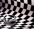
Of the three checkerboard drops I like this one best. The distortion of the background is more profound. I think perhaps a bit more exposure might have resulted in slightly whiter squares, but that's just a nit pic. Very nice image.
except for the tight crop at top this is better than the original: better DOF and sharpness, less dirt and noise, more subtle lighting and contrast. Irene?





 Add photograph to your favorites
 Add photographer to your favorites


 Photographer found comment helpful.


