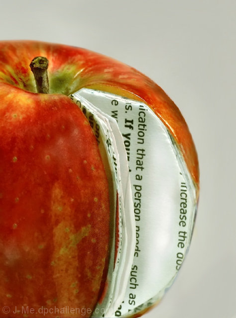
you know what they say, an apple a day keeps the DPC trolls away. If only this was maybe a little OOF, you might have gotten that illustrious and coveted score of "1". Oh well. Pretty apple! (lol)
I must in this challenge vote to how the original photo was presented. Your emulation falls short on a couple of small points. 1 your DOF is much wider, and 2 the number and fanning of the pages are quite different. All and all nice shot and a 7 from me.
Your lighting, sharpness and details are good in this composition. I can 'read' and see the words clearly. The only problems I see with this composition is the edges of the pages and the orientation of the words. For the viewers to 'bite' that the pages naturally belong in the apple it has to look the part. The edges of the book pages need to be nice & sharp as well as cleanly rounding them to the exact shape of the apple (not an easy task I'm sure but one that would pay off in the end). The other critique is that the orientation of the words going on the vertical plane just doesn't work effectively. The words really should be oriented on the horizontal axis much like it would be when you crack open a book to read. None-the-less you made a good attempt at emulating the original.






 Add photograph to your favorites
 Add photographer to your favorites

 Photographer found comment helpful.


