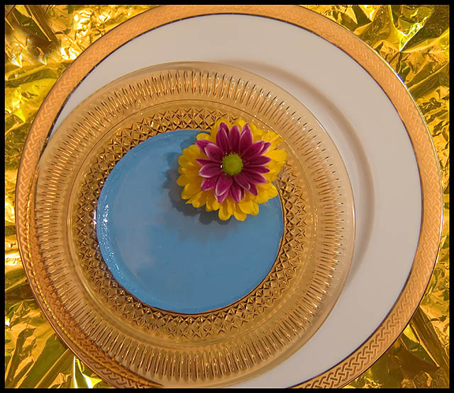
I love the original image. I have wanted to try my own hand at it. It wasn't quite as easy as it looks. I didn't have the plain white plates so I had to improvise.
The flower is not to the same scale as the original so I was going to use a leaf instead but it broke up the circles to much. SO I opted to return to the flower and added a punch of purple. No one can call me a complete copycat! heh!
Statistics
Place: 95 out of 111 Avg (all users): 5.4797 Avg (commenters): 5.4286 Avg (participants): 5.4107 Avg (non-participants): 5.5217 Views since voting: 896 Views during voting: 266 Votes: 148 Comments: 14 Favorites: 0
An interesting shot but the composition is WAY too busy with so many different colors and patterns. Sometimes less is more. Keeping an image simple and clean in design and composition of elements makes for a much more appealing image. The gold crackle background, the various design patterns in the plates and the two different color flowers stuck on top of one another just makes the eye dance for we have too much color, textures, and patterns here that nothing really stands out. Lighting could be better in that it doesn't seem that everything is illuminated evenly - an overhead light source in addition to the one on the side would evenly illuminate all objects and showcase them more. Lastly the flowers are out of focus while the plate has more detail - focusing on the flowers will make the details of the flower really stand out.
A more vivid colour control would have been more of a compliment. I like your angle...but for this challenge I feel it should have been more of a replication.
I find the combination of colours and textures remove the key quality that made the ribbon shot so great and that's its pure simplicity. It was all about the composition and the touch of colour. This entry has a lot more distractions and so is visually less striking. Technically very good though with even lighting and good focus
nice try! you transformed my image into something of a completely own style (didn't even recognize it from the thumb). Main differences are the aspect ratio (mine was square) and the crop (plates cropped at top instead of left) and position of the flower (mine was centered in the image - it was the centered composition challenge!). Good luck!
Seems a bit lacking in contrast. I like the combination of colors but find the crinkly gold BG distracting. I also wonder if a levels adjustment to make the plate pure white would have been good. 4





 Add photograph to your favorites
 Add photographer to your favorites


 Photographer found comment helpful.


