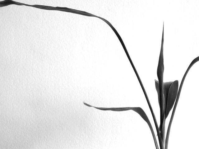
Stunning. I really like the delicate shapes and curves in this. The black and white works well to define the shapes of the flower and the subtle texture of the wall. 10 from me - lisae
needs a bit more space to avoid cropping the ends I think - or you could have cropped it a whole lot more closely - seems stuck inbetween those two options in this case.
Truthfully...the subject isn't that interesting to me, and that you cut off the tips of 2 of the leaves kind of takes from the photo. I DO like the use of neg. space. The lighting is very nice to achieve the effect of the photo, and the use of black and white is very nice. So you have good points, and points that don't work so well for me. I'll meet you half way. 5 Good luck in the challenge. ~Hbunch7187~
very nice. I would have liked it better if none of the plant was cropped out but the leaves are probably so long that you would have had to do a panorama to accomplish that.
if the wall was white i think that it would have looked better in color. i usually don't say things like this because black & white happens to be my favorite. so it really takes some convincing for me to recommend something like this. my feeling is that the plant would jump much more if it were bright green against a white background, however, the background might not have been good for it.
Love the b&w, the composition and the use of neg spc. The shot overall, is good, but lacks some appeal - for me, it just doesn't have that *it*. lhall-7






 Add photograph to your favorites
 Add photographer to your favorites


 Photographer found comment helpful.


