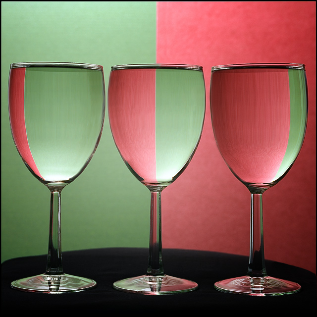
Good shot, but I don't see a match to the title for comparison. There are several ribbon winners similar to this one but I haven't seen any like this. I like the good focus on the refraction in the glasses and not on the background.
Wow, nice lighting and two-tone color refractions in the glass! You have some good colors and a very nice tonal variation in the colors of your composition. My only suggestion is that the it is that the contrast is a little flat. Boast up the Contrast in the Brightness/Contrast levels and it will visually pop even more. Saturation is a tad light. I think the composition would perhaps benefit from a little more deepness and saturation in the tones. Simply playing around with Saturation levels (not too much as that you don't want over-saturation) as well as the Brightness/Contrast levels would really take this from above average to stellar.
Whilst technically this is very good, very sharp, no lighting glare, composition is spot on. I think the colours and don't work so well, comes across a little dull
looks like a mixture of different pictures, don't know with which one to compare, for itself a nice shot, could be a little more saturated. don't like the irregular black shape here, though





 Add photograph to your favorites
 Add photographer to your favorites


 Photographer found comment helpful.


