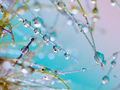
This is more "in the style of" Ursula's Far, Far Away:
than an exact duplicate.
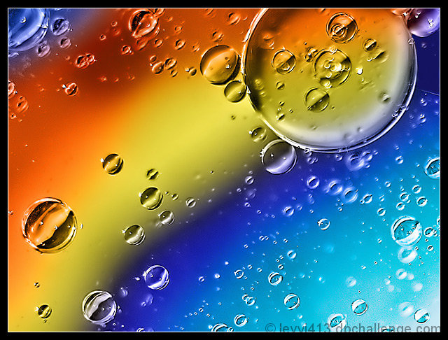
I did use oil on water over colorful paper (tissue paper for gift bags in my case, wrapping paper in hers), and I managed to get the large bubble and the stripes more or less oriented the same. But I used different colored paper and, of course, the exact size and location of the bubbles is random. The colors were radically different from this to begin with, but I changed them.
I learned how hard it is to keep the bubbles tightly grouped, which is why mine has so much more open water than hers.
Lit by the sun at an angle because it was late afternoon.
Editing was similar to Ursula's: rounds of sharpening (both for sharper edges and to enhance contrast), a curve to enhance contrast more, and some noise reduction both before and after resizing. I also cloned out some distracting black spots and painted over a small, but blown out, thing in the upper right.
Finally, there's the color change. I realized that maybe I could match Ursula's colors by using her image to color mine. I desaturated my image by using only the green channel. Then, I copied her image and blurred it to lose detail, and set the blending mode to color. It worked quite well, and I had Ursula's permission to use her image that way (as the copyright holder, I mean, not as an SC member). But in discussing the technique with her, I realized this might count as compositing her image into mine, which would be illegal. I tried using PS's color match adjustment, but the colors looked horrible. So I just dropped her image and created my own color map by hand, choosing the colors out of her image. And I followed the contours of my image, so there aren't any new shapes.
Statistics
Place: 32 out of 111 Avg (all users): 6.5669 Avg (commenters): 6.9231 Avg (participants): 6.5091 Avg (non-participants): 6.5980 Views since voting: 1999 Views during voting: 303 Votes: 157 Comments: 18 Favorites: 2 (view)
You did such a good job on this Jeffrey! And congratulations on having such a fine photo to grace your "best photos" on your profile page. It is a very fitting place for this one.
The title here threw me...although I knew the original author. That would have made some voters disgruntled...make sure that future Deja Vu entries are easy for the voter to link to. I like your attempt...but feel it is over neat images...and the detail just isn't the same. Good try though.
nicely done, though you have less drops (you haven't been as far away probably) and the color transitions aren't as smooth as in Ursuals shot. I prefer her crop and placing of the larger drops, but think the sharpness and saturation in your shot are better.
Absolute WOW! Love the the vibrant colors of the rainbow captured here. The level of detail is wonderful with the waterdrops/bubbles looking nice, crisp and clean. As visual eye candy goes this composition draws you in with it's nice level of details and those stunningly beautiful colors. I have nothing to critique! Well done.





 Add photograph to your favorites
 Add photographer to your favorites


 Photographer found comment helpful.


