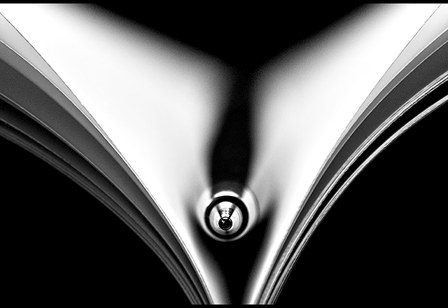
My poor attempt at the Symmetry II red ribbon by Techo.
Taken with the reversed 50mm f/1.8. This shot is insanely tricky to set up and this is as close as I could get.
Lit with a single flash above the paper and pen, bounced off a white umbrella. I had my flash stand (an old tripod) balancing on top of my monitor, umbrella sticking into the air, a disaster waiting to happen...
Performed the B&W conversion in ACR. Crop to the same aspect ratio as the original. Noise Reduction. Resize, Luko sharpening, border and save for web.
Statistics
Place: 27 out of 111 Avg (all users): 6.6581 Avg (commenters): 7.0000 Avg (participants): 6.3774 Avg (non-participants): 6.8039 Views since voting: 1560 Views during voting: 379 Votes: 155 Comments: 13 Favorites: 2 (view)
Wow, great job in emulating the original. Tis a great rendition but it could be spectacular if just a few things were done. First, I think it would increase visual impact if you increase the DOF in the shot. It would show more details along the length of this pen. As it stands now the only portion in sharp detail is the point of the pen. If you notice the photo info on Techo's version he used an aperture of 8 and a low shutter speed of 1/15. By doing so, he increased his Depth of Field so that not only the foreground is in sharp detail but the background is too. Next I think that spreading the pages out more so they are not clumped in bunches adds more clean lines to the photo that will make it more visually appealing.
Good rendition of Techo's shot. good lighting, good b/w conversion. Your POV is slightly lower, overall it seems you didn't put as much effort in the shot, the spreading of pages is less elegant and symmetric, your DOF is too shallow, the tip of the pen hasn't got the graphic quality Techo's has.
Nice try -- very close. The light/contrast on the original was softer and more pleasing, and the pen was more visible. Still this is an interesting image.






 Add photograph to your favorites
 Add photographer to your favorites



 Photographer found comment helpful.


