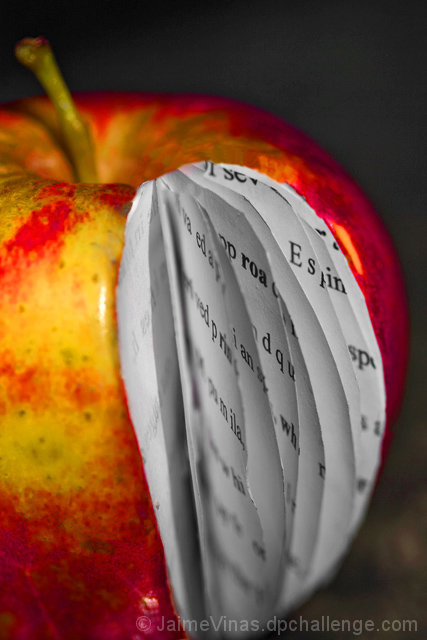
Your lighting, sharpness and details are good in this composition. But there are a few things you can do to improve the visual impact of the composition. First is to change the angle slightly. To me, it looks like the camera is positioned slightly above the apple rather than at eye level to it. Placing the main element at eye level will make it easier for the viewer to 'read' the pages. In addition you need to angle the open wedge of this apple a bit more away from the viewer so that the pages are a bit more readable. In your composition they are at an angle that does not make them easy to see. Kudos for trying to make the edges nice, sharp and rounded to conform to the shape of the apple. There are a little rough edges here. For your viewers to 'bite' that the pages naturally belong in the apple it really has to look the part. Sometimes the devil is in the details. Rounding off the edges of the book pages to be nice & sharp as well as cleanly rounded (not an easy task I'm sure) will pay off in the end. None-the-less a good emulation on the original.







 Add photograph to your favorites
 Add photographer to your favorites


 Photographer found comment helpful.


