| Author | Thread |
Comments Made During the Challenge  |
|
|
09/23/2007 02:19:09 PM |
|
Beautiful work, strong and emotional. |
|
 Photographer found comment helpful. Photographer found comment helpful. |
|
|
09/23/2007 01:19:31 PM |
|
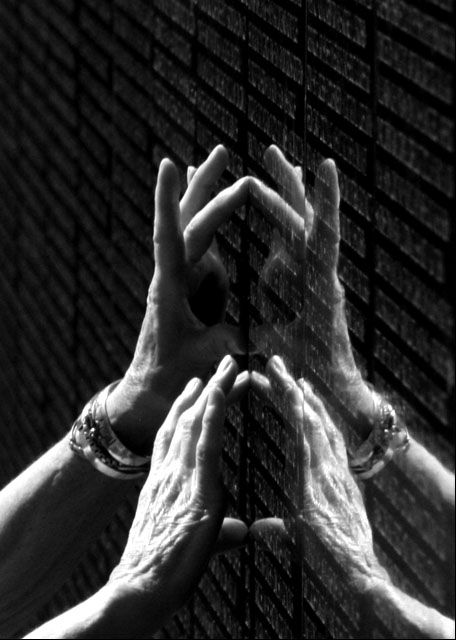
A very nice recreation of the original. You have some good details here and there in the composition but I think you could capture some more. First off the angle is a little too extreme such that the names are not AS visible as they could be. I would recommend standing at eye level to the names and maybe at a 50 to 60 degree angle away from the surface of the wall to be more akin to the angle seen in the original. Lighting is also an area that needs a bit of improvement - a large portion of the hands & arms are in shadow while the portions that do show have some blown highlights that we cannot fully see the details of the hands (such as the wrinkles and fingernail on one finger). Given that this is more than likely natural lighting you need to be careful in getting the right exposure. It may take some bracketing (taking multiple shots with different apertures and/or shutter speeds) to get the correct exposure. With correct exposure you can get all the objects in the shot to have some nice even lighting. If this is a conversion from color to B&W be careful with the Brightness/Contrast levels and/or Highlight/Midtone/Shadows for too much can blow highlights...although these same controls can be utilized to correct some of the blown highlights and deep shadows if you just play around with it. Lastly the position of the hands really doesn't lend itself too well to the emotional impact of the photo for the hand in the foreground looks like it is pressed to rest on the wall rather than read the names (it is the position of that thumb that gives that impression). The reflections are also a bit too far away from their reflected source and it makes the scene look a bit too confusing and busy. Having the hand lay flat or closer to the surface would make the "touch" against the wall have more gravitas for two reasons. One, the refection would be closer and thus less of a distraction. Second, a more subtle setting of a somber mood would be established with the living hand touching the wall of names and all that is 'given' back is just a reflection; there is no warmth of human touch back to make contact with that hand resting on the wall. |
|
| Photographer found comment helpful. |
|
|
09/23/2007 08:10:35 AM |
|
I like the attempt but the hands and etching become a little lost in the tones and angle of the image. |
|
| Photographer found comment helpful. |
|
|
09/22/2007 04:58:15 PM |
|
If you want to grab my heart, the “Wall” will do it. In this emulation I think you missed on the full emotion of ClubJuggle’s in a few ways. The original had a better angle to the wall, the hand placement has more natural feel to it, and the lighting is smoother. Giving all that this in a challenge by itself would be a top 20 picture, but compared to the original I can only give it a 7. |
|
| Photographer found comment helpful. |
|
|
09/20/2007 08:24:59 PM |
Mother and daughter find husband and father. 10
Message edited by author 2008-01-02 15:10:59. |
|
| Photographer found comment helpful. |
|
|
09/19/2007 04:20:45 PM |
|
Another tough call on which I prefer. I'm leaning toward yours becasue I prefer the hands that you have used. His may be a smidge better lighting. |
|
| Photographer found comment helpful. |
|
|
09/19/2007 04:03:26 PM |
|
A very eerie version of this image. The placement of hands and reflections of same almost creates a grinning "deaths head" in the center of the image. Almost wearing a crown. Maybe saying that when man wages war, it rules over life. It also seems to display the increasing age of those who were victimized by that war. I like it. It's disturbing. Bumping it up a point while commenting. |
|
| Photographer found comment helpful. |
|
|
09/17/2007 10:40:41 PM |
|
I love the emotion behind this shot. Nicely done. |
|
| Photographer found comment helpful. |
|
|
09/17/2007 09:57:26 PM |
Good angle, but the hands' positions look forced. In ClubJuggle's shot, it looks like several people reaching to touch the name of someone they all loved.
Also, the hands are a bit blown out. |
|
| Photographer found comment helpful. |
|
|
09/17/2007 09:10:23 PM |
|
I think this is a very nice composition. It doesn't have quite the emotional impact of the other, but it has it's own merits. |
|
| Photographer found comment helpful. |
|
|
09/17/2007 06:44:36 PM |
|
| Photographer found comment helpful. |
|
|
09/17/2007 08:13:31 AM |
|
| Photographer found comment helpful. |
|
|
09/17/2007 05:35:16 AM |
|
wish the angle was the same, and a hand was flat on the wall. |
|
| Photographer found comment helpful. |
Theme:
Classic /
Light /
Dark
Home -
Challenges -
Community -
League -
Photos -
Cameras -
Lenses -
Learn -
Help -
Terms of Use -
Privacy -
Top ^
DPChallenge, and website content and design, Copyright © 2001-2026 Challenging Technologies, LLC.
All digital photo copyrights belong to the photographers and may not be used without permission.
Current Server Time: 10/14/2026 06:26:56 PM EDT.






 Add photograph to your favorites
 Add photographer to your favorites