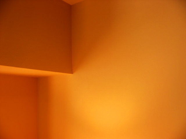
For those that care to know, the room is not quite this orange. It is a shade of orange, though, and I enhanced this somewhat through photoshop, but most of the credit goes to the late-afternoon sun. Also, a lamp was used to get the nice glow on the right-hand side. Thanks for all the comments... It was nice to see so many folks connect with my take on negative space!
I love the color and abstractness of this. The shadow lines on the lower left are a bit distracting. It might be better if the lowest level was all in shadow or all lit. (It might not be possible, but it's a thought.)
Going with a 6 because of originality and vision. for neg space, the space augments the subject. In this photo, the space IS the subject. Fine distinction.
Vignietting in top and bottom right makes the space look cramped. The light needs to be getting brighter all the way to the right edge, or at least not get as dark as it has done.
I am sure some people hate this because it is boring or some other idiotic comment. anyway, I think it is a great study of form and light. congrats. cmcvety.
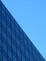
You know why this is so interesting to me? Because you made me count the lines! Not only that, the light is beautifully accentuating the architectural design and the color is beautiful! If there is any way to crop this differently so that at least one of the lines would be parallel with the edge, I think it would improve it. 9
I love this GREAT shot. Great work My favorite thing is the colors (are the walls really that color?). The lighting is great - especially the shadows. I think the colors create a nice sort of peaceful atmosphere - as opposed to a b/w that may make it more dismal and perhaps depressing. This is so clean. I find it amazing how you were able to turn this ordinary, usually unobserved portion of the room into an amazing pic. Excellent!!! 10 Ruthann (updated)






 Add photograph to your favorites
 Add photographer to your favorites


 Photographer found comment helpful.


