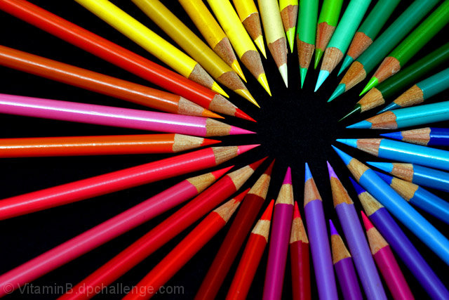
Nice, clean picture, in many ways a improvement, I believe though that the original artist placed slightly oddball colors intently to make the viewer pause. A 9 from me.
Good emulation. The colors are in different positions, but I kind of like this better because they are not so mixed up. It's also sharper across the whole picture.
Wow, nice color variation on your emulation! I like how you pretty much tried to kept to the original in variating the pencil positions. One will be high then next low then one high and the next low. You kept a pattern going a bit but then you stopped with adding two pencils between the higher ones (as seen on the far right hand side). Not breaking a pattern of repetition is important for it keeps the composition a cohesive whole. Breaking the pattern breaks the chain and makes the imagery a bit disjointed. The overhead looking down angle while good at showing us this radiating circle it doesn't add any additional visual interest. Angle can add interest. Shooting at a slightly lower orientation and at a 30 -60 degree angle can add some visual interest as well as showing this radiating color wheel of pencils.








 Add photograph to your favorites
 Add photographer to your favorites


 Photographer found comment helpful.


