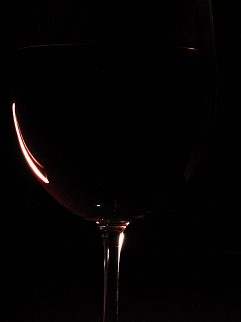
Gordon, I absolutely LOVE the changes you've made. It is so effective in fact, that when I look at the new image, my eye draw the rim of the top of the glass. I had to look at it for a long few moments to realize that it was an optical illusion and the rim of the glass does NOT infact appear in the photo. Very effective. just-married
Not sure if the link will work here, but this is how it was supposed to look :)
I had it pretty clearly in my head, it just took quite a bit of learning about lighting to turn this rather drab rendition into the shot I was looking - shame I did it a few days too late! Thanks for all the comments and taking the time to look.
Nice work. The shape is suggested only by the lighlights, the glass is otherwise not visible. It is still slightly visible, on a bright monitor or such, but the effect is creative and striking.
I like it very much. I think it is SO CLOSE. To me, the small light spot revealing the rim at the top is not quite enough to help visualize the shape of the glass. Still, concept and execution are very good. 8, just-married
Made very dark to empfasize the reflected/refracted light, but too dark to make much else out. Good idea, but needs a little more experimentation with lighting. 7
just a teeny bit unerexposed, want just a little more out of the light we see, bet it would've produced another line or light source if you'd done something else, right? nice work though, high eight.
This needs a little more exposure. The effect would be the same, just the subject would be a little more...visible and distinguishable while still intriguing the viewer.
For once I am gonna say I want it more centred! And the stem to be vertical! I'd like just a teeeeeny bit more of the glass edges and form to be highlighted without showing the whole object. For my tastes this one leans too heavily into the neg space without enough impact from the positive. Sorreeee... 4, Kavey
This is great negative space and very effective lighting to achieve the image. The very subtle rim of the glass being visible makes a great difference... good shot :) = 10 - jmsetzler
Very pretty...one of my top this week. My only hang up is that the glass looks like it's leaning toward the right. Could just be the angle, or the lighting, or maybe it's just me. lol. I like the slight hint of color, and I like how the "negative space" is needed to make this photo what it is. Great job and good luck in the challenge. 9 ~Hbunch7187~
Excellent photo, very well set-up and executed. I would prefer another title (e.g. EMPTY) but that is the only suggestion I have. You deserve a drink for this one!





 Add photograph to your favorites
 Add photographer to your favorites


