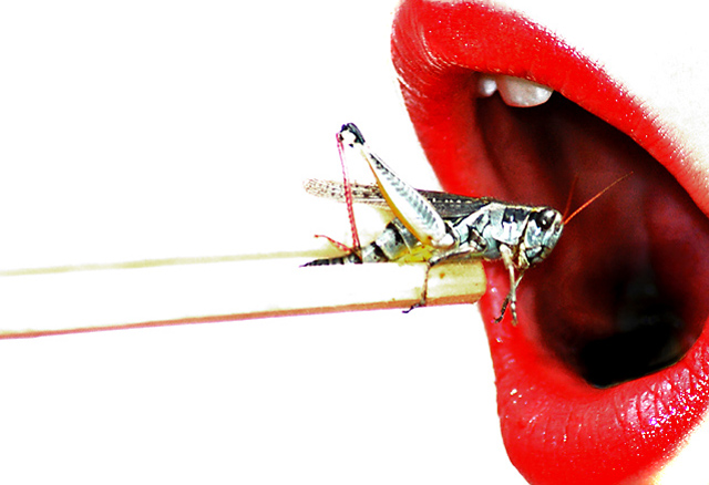
Thanks for the comments. I knew it was all blown out, but I didn't realize the angle was bad until I really started working on the shot in PS. Lots of mouth parts and bad views of teeth. Didn't have time or daughter avaliable for reshoot. Oh well, I had fun and learned a bit too. FYI: It was a living grasshopper, uniceboxed, and let go after the shot.
Great job on comments CNovack, haven't had a comment that detailed since some of the original Critic Club comments.
Seems like I was the one and only who thought this was awesome. What others saw as technical flaws, I saw as a plus towards highly stylized art. Oh well - sorry it didn't score higher for you.
Um, O.K. as much as I find the thought of a cricket/grasshopper very unappetizing I do appreciate all the fine details and the technicals of this composition. The composition of element is sound and it is framed good, but the lighting needs to be toned down quite a bit for many areas are overexposed washing out details and the richness of color tones. The colors of the red lips, the grasshopper/cricket, and most especially in the chopsticks are very washed out. The overexposure is most evident in loss of detail in the chopsticks - they appear blown out and portions almost disappear against the white backdrop. The skin around the lips is also overexposed with no skin tones visible at all. It almost looks like the skin is the same color as the white background. The overexposure washes away any fine details that might be seen in the 'texture' of the lips. As it stands in the composition here there is very little texture to showcase the lips because they look very flat. Toning down the amount of light in your photo by either adjusting the aperture & shutter speed for correct exposure or, if used, scaling back on Brightness/Contrast levels in PS would bring back the richness in color tones and the details/textures of the objects seen within.






 Add photograph to your favorites
 Add photographer to your favorites


 Photographer found comment helpful.


