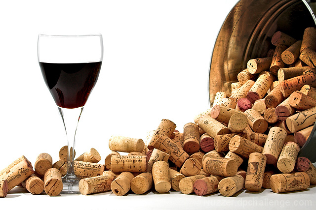
Have I said before that I hate "studio" lighting? Grrrrr! I wouldn't be without the ST-E2 for my flash though.
Editing Steps: Convert from RAW
Shadow/Hilight
Levels
Brightness
Levels on the glass
Shadow/Hilights on the glass
Curves on the corks in the bucket
Brightness/Contrast
Levels
Warming filter on the corks
Flatten
Crop
Resize
USM
Save for web
Statistics
Place: 50 out of 111 Avg (all users): 6.2649 Avg (commenters): 6.7273 Avg (participants): 6.2264 Avg (non-participants): 6.2857 Views since voting: 1251 Views during voting: 289 Votes: 151 Comments: 12 Favorites: 1 (view)
Wow, image clarity, details, and composition are all spot on. Great presentation! This is a very close emulation of the original. The only critique I have is that the wine in the glass looks flat. It looks more black which is not characteristic with red hues of a deep burgundy or red wine. Perhaps shining a spotlight or adding another light source to shine specifically on the glass with showcase some of the lovely red hues in the wine that are not present in this composition. Adding that punch/touch of red in the wineglass will really help improve the visual appeal of the image.
I like yours better than the original by just a bit. Your background is nice and white. Pidge's has a slight pinkish cast on my monitor. Otherwise, they are way to close to differentiate.
The high key background in contrast to the cork and container are great offsets to this image, the detail of the glass stem and base are fine but the lack of depth in the glass rim and lack of clarity and color of the wine(?) detract from the image impact.
I can imagine this shot hanging in someone's kitchen or bar area... I love the shot but not fond of the stark white background. Great focus/sharpening on the corks themselves, tho! *6*
Very close. Nice going. The lighting in the original is a little more pleasing to me. The wine had a bit of color and glow and there was a nice reflection on the glass.






 Add photograph to your favorites
 Add photographer to your favorites


 Photographer found comment helpful.


