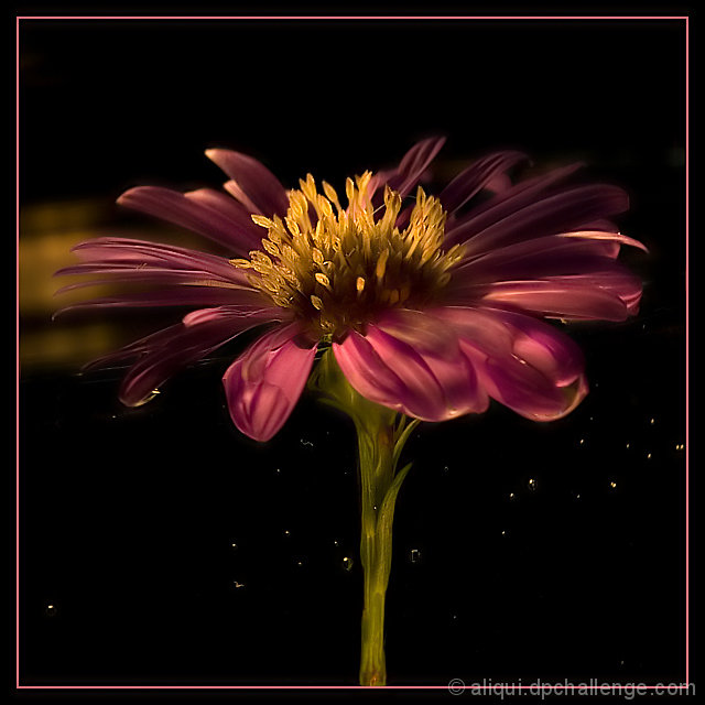
This is one of the first images that convinced me that DPC was a place to stay. SherwinJames was nice enough to describe exactly how he came up with his result. This is my ghetto version. I also tried an Ursula image, but my flower wilted before I could even get close. Trying to duplicate something like this really makes you appreciate the talent of the original photographer.
Rotate
Crop
Brightness/contrast
Cloned out a small bit of distracting reflection.
A small bit dodging and burning
Sharpening tool
Unsharpen Mask
Border
Neat Image
Save for web
Statistics
Place: 17 out of 111 Avg (all users): 6.8684 Avg (commenters): 8.2500 Avg (participants): 6.5849 Avg (non-participants): 7.0202 Views since voting: 2478 Views during voting: 295 Votes: 152 Comments: 22 Favorites: 7 (view)
I hope Sherwin doesnt get offended, but I like yours more, with an amazinglighting and lively colors tones! I'd love to see your set up on this one. This is my top 1 favorite of the challenge. Congratulations!
the contrast around the center of the flower is way too low to really mimic the original shot, however i LOVE this flower shot it is ellegant and beautiful and i almost like it more than the original
A Magical Place is one of my favorites. I think you did an excellent job in trying to emulate the original. While the pink color of the daisy does not show the ring of light that illuminates the yellow/orange daisy of the original you do have a burst of lovely yellow hues from the center portion of the flower. Love the rich warm tones and the level of detail you show us in that center yellow portion of the flower. I also love the sharp yet soft feel of the pink petals of the flower. I'm not sure but the thin pink border does not seem to exactly match any of the hues in the flower petals. I think that pink border would be better if you picked a deeper pink from one of the flower petals (mayhap you did but I think a deeper tone than the paler one here would work better) One last critique, there is something in the background off to the left side of the flower. Either it is movement or an object but nonetheless it becomes an added element that detracts attention away from your main focus. Eliminating that will really help make your flower pop off more on that black backdrop.






 Add photograph to your favorites
 Add photographer to your favorites


 Photographer found comment helpful.


