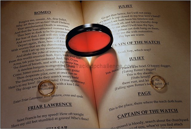
I finally got it right!!! I have had all the materials and earlier attempted this idea which has been on the back burner for 11 months. That's right - 11 months. Lighting was the KEY issue. Tribute to Konador's - Thank you Konador for that tutorial on your ribbon winning Shadows II entry detailing how you created your Heart shadow. It was instrumental in getting the final product looking like this.
I knew I had to wait for the Deja Vu challenge for this idea to be more readily accepted even though there are elements in the composition that changes the mood drastically.
You will not EVER find a copy of Shakespeare's Romeo & Juliet that has their deaths occur on opposite pages like it does here. Typing up the text and printing it up on opposite pages made this possible.
I do not have a red filter so I used my Polorizer Filter. I cut out a red plastic circle from those colored plastic report covers (had to do it 25+ times to get the right size)and fit it inside the filter.
Created a makeshift light tent and used 4 lights angled in different locations to achieve the final result which took 2 nights of shooting.
And hopefully someone out there will also recognize the title as a literary allusion as well. Title is from Dylan Thomas's poem And Death Shall Have No Dominion
Symbology:
Romeo and Juliet are physically seperated on opposite pages.
Although death and physical location seperate them they are joined together by the heart symbol representing love.
There are three rings present; both of the rings surrounding their names and then the 'ring' that casts the heart shadow that symbolically joins them for 'death has no dominion'
Statistics
Place: 43 out of 111 Avg (all users): 6.3806 Avg (commenters): 6.9231 Avg (participants): 6.2593 Avg (non-participants): 6.4455 Views since voting: 6005 Views during voting: 363 Votes: 155 Comments: 17 Favorites: 1 (view)
I have really enjoyed reading the notes on this BRILLIANT photograph. It is truly a masterpiece. All the careful work you did really paid off. I think many of the details, such as the rings surrounding the names were lost on the quick voters.
As for the comparison to Konador's original, I think you took a good idea and really ran with it. Besides giving meaning to the heart shadow, you have made many other significant improvements. I like the softer contrast for illustrating love, I think the softer, heart-shaped general lighting is better, and of course the printed pages give a purpose to the whole image.
I hope you have found other audiences for this. You have inspired me to put more effort into my work. Thank you.
I think I remember this one, but I'm having trouble finding it with the title clues you gave. No strings match from what I can see. It looks very good, though I don't know what to compare it to. There is a little glare from the light source to the right of the filter especially.







 Add photograph to your favorites
 Add photographer to your favorites



 Photographer found comment helpful.


