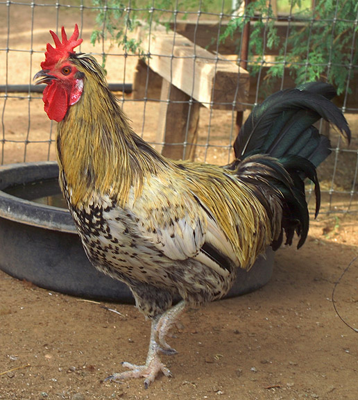
Photo taken of ribon winner user name challange entry rooster. Photo taken of rooster adjusted brightness and contrast using photoshop 7.0 Cropped image.
Statistics
Place: 110 out of 111 Avg (all users): 4.8456 Avg (commenters): 4.8889 Avg (participants): 4.8519 Avg (non-participants): 4.8421 Views since voting: 1369 Views during voting: 252 Votes: 149 Comments: 9 Favorites: 0
Have a look at the original. Really study it. Work out what makes it a winner. Be really drastic in your findings...then compare the two and you will understand what you need to do to bring your version to the same standard. I am saying this to help you...please take it in the way I intended.
Hmmm, this is a good shot of this rooster but I have to say it needs some improvement to make this a stand-out shot. First of all the arrangement of elements in the shot can make or break the visual appeal of an image. Generally a background of chicken wire and a rubber water bowl is not appealing nor a terribly complimentary background for this rooster. I think it would have been better to wait for the rooster to move further away from this backdrop or in the very least away from that black rubber water bowl. If far enough from the chicken wire fence you could adjust your aperture and shutter speed such that you get a shallow depth of field. With a shallow depth of field that fence would be a blur in the background while your main subject is in sharp focus - it operates under the same principles of bokeh. This article is just one source example - Bokeh - scroll down to take a look at the picture difference in the section talking about amount of blur. Now this species of rooster is very different than the species in Noraneko's blue ribbon so the vibrancy of color hues is not as evident. But your rooster does have some interesting shades of color and there are some green glints in those tail feathers. The thing you want to do is make those colors really pop visually. Noraneko mentioned that she used selective colors to individually pop each color channel. You might have to play with those color channels. Other possible suggestions is to play with Highlight/Midtone/Shadows and adjust Saturation levels to increase contrast and color hue to make the colors pop.
I've tried to photograoh rooster at the fair. They're twitchy and hard to get without blur. Nice catch, but unfortunately not up to the color, sharpness and sheer vibrancy of the original.





 Add photograph to your favorites
 Add photographer to your favorites


 Photographer found comment helpful.


