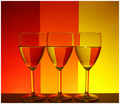
I like his much better... but I've always wanted to try this style of shot, not because I like them, but because I want to see how the voters react.
Anyhow, I believe Alex got a much better depth of field with his shot, but I'm impatient and stopped shooting once I got the light and reflections right.
I also used cheap glasses... hence they're slightly different sizes, don't kill me.
PP:
Crop
Clone a few glints in the glasses.
Levels
Hue/Sat
Border
Statistics
Place: 58 out of 111 Avg (all users): 6.1192 Avg (commenters): 6.2727 Avg (participants): 6.1273 Avg (non-participants): 6.1146 Views since voting: 1219 Views during voting: 268 Votes: 151 Comments: 11 Favorites: 0
The glasses being uneven (at the top) steals from an otherwise good composition. There seems to be also some angle to the subjects, as the water is well leveled, but the table's edge is not.
Wow, nice lighting and color refractions in the glass! You have some good colors and a very nice tonal variation in the colors seen here. My only suggestion is that the it is a little dark and the vibrancy of the colors in your composition could do with a bit more zing. Simply playing around with Saturation (not too much as that you don't want over-saturation) and boasting the contrast on Brightness/Contrast levels could make the colors really pop off the page.
don't care for the colors, but you missed that the background of Alex' shot is out of focus and ONLY the refractions are sharp, which is essential for the overall impression. Besides that, your glasses don't stand even.
I really like the vividness of the colors reflected in the bases. Seems a bit muddy on top, light falloff I guess. And it sure does show how irregular some wine glasses are shaped. 6






 Add photograph to your favorites
 Add photographer to your favorites


 Photographer found comment helpful.


