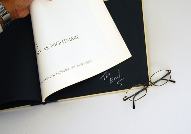
I think I'm missing something. I'm trying to pair the title with the words on the book and I'm not quite getting the connection. Nice composition in the photo.
Interesting idea combined with good overall exposure, composition and synchronization with the challenge theme. I wish there were a little more of the hand in the picture, though. The tip of the thumb seems lost by itself. It should be out or, better, in more with at least one finger. That's my two sense [sic]. Voting an 8.
Composition: Subject Placement, Cropping, Background v good,
Technical: Focus, Exposure:v good,
Appeal:lovely soft colour, good focal point sad to come to the end of a good book!
Total Averaged Rating 7.
Very nice idea. The hand is a little awkward. It should probably be a more important element in the photo or not there at all. Right now it seems halfway between.






 Add photograph to your favorites
 Add photographer to your favorites


 Photographer found comment helpful.


