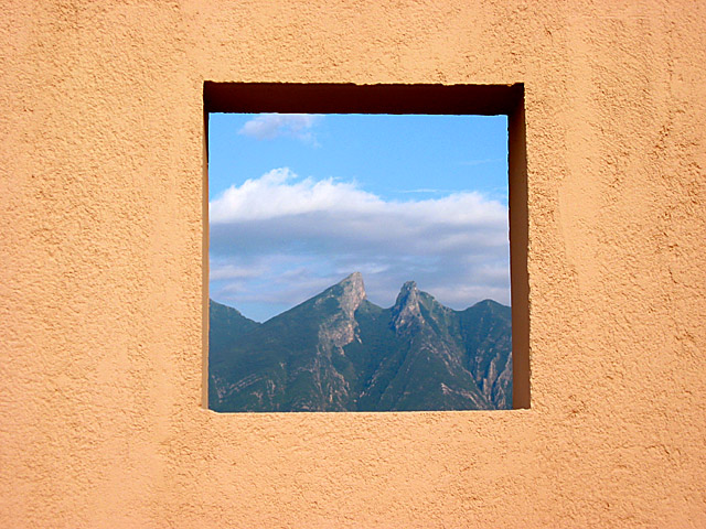
This is a great picture. You have done a great job of using negative space. Lighting and focus are good. Your subject matter is great... (3 greats in one comment... Wow....) waltoml 9
Be wary of over-sharpening a photo like this. The significant color differences between the frame and contents can create a "halo" effect and make it look like a composited image...
Great shot! I think this could have stood a little less framing, but that's personal taste. Most shots I am commenting on receive no plus or minus for negative space, as I am "not getting it". (Not your fault, it's me, really!) 10 Swash
Very appealing image - the negative space (wall) certainly adds a lot of appeal to this image - very warm tones contrasting to the cool tones of the distant view.
Don't you hate it when you have a great idea and someone else has the same one? This is just excellent tho. Nice colors & beautiful view. Light seems a bit harsh maybe. 9 ~indigo997
I like this image, it looks like a SW scene, maybe NM? I am not sure that it really meat the challenge though. Negative space is something that compliments and accentuates the subejct. These subjects are competitng for my attention. You have a very nice photo, worthy of display, and I will vote it as such. For ways to improve this specific image: Maybe a UV/Haze filter, or a polarizing filter would bring out the mountains a little more. Good eye for a great subject.
haha this is the same thing that i was going to do but only with a paper that I just cut the window in. This is much better. I'm glad that i didn´t post this week. great jop and extra point for having the same idie. -rocco22-
Nicely done! I love the colors and the dynamics created by the shift from the simple smooth texture of the wall to the grand, rough texture of the mountains.
While many of the entries this week were good photography, few actually really understood the assignment of negative space. You clearly understood and did an excellent job of portraying it. Good job!






 Add photograph to your favorites
 Add photographer to your favorites


