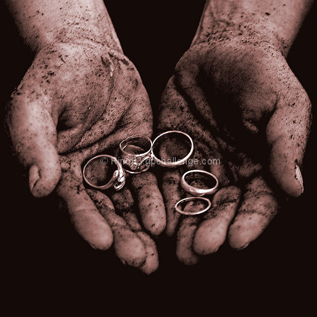
This is a good attempt at emulating the original. You have all the major elements present in your composition. While a good shot there are several areas that need attention for this to catapult into the exceptional category. The tones and contrasts of this composition appears a bit flat. There is a dull pinkish cast to the hands. The first thing I would recommend is to try another light source to illuminate your subject more strongly. Not only would it illuminate the differences between the light and dark areas of the skin more but it would put a nice sheen on those rings making them really shine. In addition to adding another spotlight, you might need to play around with the Brightness/Contrast levels - specifically to increase the contrast which is what Larus said he did in the original. He also mentioned he decreased the saturation which most likely decreased or eliminated most of any pinkish tones present. You might even have to do some dodging & burning to further increase the contrasts of light and dark areas on the main subject to really make it pop off the page.
Honored you chose one of mine to pay tribue to :) I like that the lighting is more soft in this shot, makes it more a timeless photo than mine, a bit more artsy as well. Also cool you decided to duotone it, I was not sure when I chose to have mine in "color" (although it may as well have been sepia toned as all the colors in it was so similar). Nice job!






 Add photograph to your favorites
 Add photographer to your favorites


 Photographer found comment helpful.


