Author Thread Comments Made During the Challenge
Post actions
i like the composition, no detail in he leather though!
Post actions
Post actions
I love the black! Anyone who says there is too much black lacks creativity. 8
Post actions
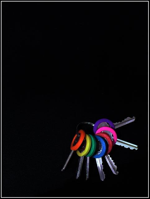
Atractive photo. Keys would benefit from being sharper though...
Post actions
I think of a pink floyd album cover... too much black, not enough interest.
Post actions
I've seen this before. I think I caught this on Pbase. Good use of negative space, but the keys are a bit dark. I like the idea.
Post actions
BW would have been preferable. and the frame may look better with the keys a little more towrds the center.
Post actions
I like this image, even with all that negative space. But the lighting on the keys has to be perfect to pull this off, and I think it needs improvement.
Post actions
to much black needs to be cut down more, nice idea though
Post actions
Like the setup but I think it needs more light.
Post actions
Keys lost in the garage? Maybe?
Post actions
Love the vibrant colors but don't get a really strong "garage" feel. I would have also probably cropped it tighter.
Post actions
I like this idea alot for the challenge. I like the simplicity and the colors and the lighting. . I think the empty area (is that what's referred to as "negative space?") is a bit much though. I would have like this cropped down just a bit. Good job on shooting this one though.
Post actions
Too much negative space, not enough lighting.
Post actions
Nice composition and interesting use of negative space.
Post actions
This is the photo that grabbed my eye from the thumbnails. Excellent. I am sure that will be a ribbon. You might have a few complains about the negative space though. 10 from me.
Post actions
Post actions
Very professionally presented. How about leather texture?





 Add photograph to your favorites
 Add photographer to your favorites


 Photographer found comment helpful.


