Author Thread Comments Made During the Challenge
Post actions
Not enough tonal range in the subject.
Post actions
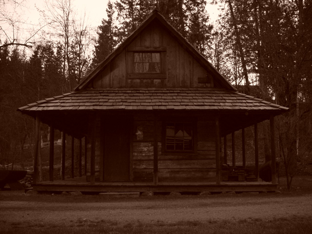
Looks like a great place. If you could pull some more detail out of the shadows on the porch...
Post actions
way too dark for a subject. shape not emphasised well for a silhoutte.
Post actions
Charming structure and sepia tone effect. I wish I could see more of the interesting detail.
Post actions
I really like this one. Wish it was a little bit lighter. May be my monitor though.
Post actions
Post actions
Post actions
adorable building but it's too dark :o(
Post actions
is this sepia toned? is that even allowed...either way, though, i dig this because it reminds me of the house from the movie, "evil dead."
Post actions
Post actions
This photo is a little dark for me to comment on extensively... I can't see the detail of the woodwork on the cabin. I like the sepia tone of the image...
Post actions
Post actions
Post actions
Nicely centered. My previous comments have all been about centering and slight crookedness. This seems perfectly framed. Sepia tones add a nice touch.
Post actions
love the color. really nice, simple composition.
Post actions
classic style - could do with prehaps more contrast - it is a bit dark and muddy, but a very moody shot
Post actions
Is this supposed to B&W, or is that what is called "sepia"? Not sure what it is, but to me something does not seem right about this: too dark, not quite in focus
Post actions
It is too dark to really see the cabin
Post actions
nice framing; a bit dark;
Post actions
I definately like this. The colorization is perfect for setting the mood of the photo.
Post actions
I think there is a building back there.
Post actions
I always think sepia is a great tone for these settings.
Post actions
neat, but a little too dark
Post actions
this could be a really nice shot with a little more exposure. a little dark as it is, though.
Post actions
I like the sepia effect. The picture seems a bit dark, but the focus is strong.
Post actions
nice sepia shot - bet there's good fishing not far away!
Post actions
Picture is to dark..but nice stucture
Post actions
cool pic. too bad it's so backlit. i would prolly have raise the levels a little more to get more detail on the bldg itself.
Post actions
Sepia? Reminds me of the Sticker Club machines all over Japan.
Post actions
I like this old house. My eyes are drawn to the "loft" window, but the choice to go so dark kept me at a distance (if that even makes sense) instead of drawing me in. There is the potential for a great picture here.
Post actions
the contrast is too soft for me, the building might work as is if the trees in the background were close to black, right now I'm losing the building in them.






 Add photograph to your favorites
 Add photographer to your favorites


