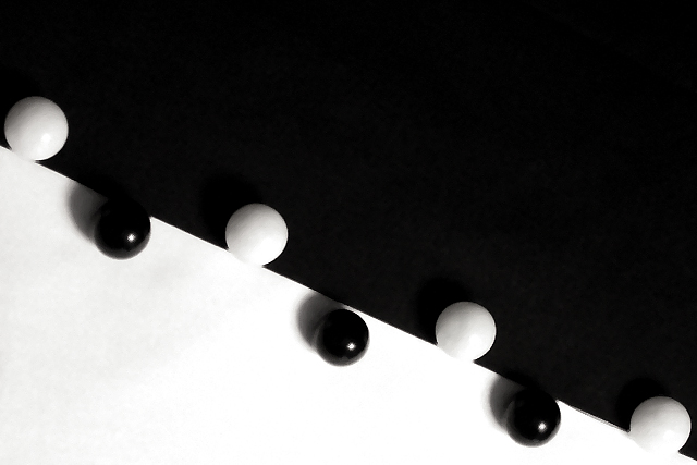
Dunno what to say other than I worked under Tungsten lighting, used a tripod and took several shots. I had a difficult time choosing from several that I like a lot.
Statistics
Place: 22 out of 218 Avg (all users): 6.4373 Avg (commenters): 7.7000 Avg (participants): 6.4621 Avg (non-participants): 6.4176 Views since voting: 2558 Votes: 327 Comments: 30 Favorites: 0
Great idea - did you mean for the slight lack of overlap in the middle ? Seems slightly softly focused - I think I'd prefer it more crisp for such a graphic shot, maybe even with more extended contrast to make it more of a black and white than it is.
Clean, sharp and reasonably striking. Nice composition, good that it's not exactly a mirror image within the frame. Not sure it's one I could spend hours looking at, but nice contrasts and highlights. Is that your Go pieces? Or Othello? 6, Kavey
This is a very nice idea... I love contrasts, as well as black and white images. I'm exceptionally glad that you didn't terminate the diagonal in the upper left corner. I think that the off balance symmetry here creates a very nice image... The only item here that I don't care for is the direction of the light. I would rather see the shadows from the black beads cast into the black side of the image where they would be invisible. Meets Challenge: 10 Technical Merit: 8 Artistic Merit: 10 Creative Merit: 9 WOW Factor:8
This shot jumped out at me immediately with its simplicity. Part of me would like to see it going corner to corner, but the other part of me likes the assymetrical part. karmat
the white ball near the bottom is offsides, so the black balls get to move ten yards towards the goal. Great shot. You should have tried to run the line from corner to corner. 8
I like the idea behind this photo. Might have looked better if the lighting was more directly over the black marbles. The shadows kind of take away from the affect. Focus looks good. Good usage of negative space. 7
all of the balls should have been lined up on the line or none of them should have. Something looks wrong with the dividing line in the lower right corner. A picture like this calls for perfection. great idea and use of negative space. 7
I like this picture alot, but I'm disurbed by the shadows. Even if the give the picture som life... I would like to have prefered less or non shadows at all in the picture.
very creative and clean. i have one thing that detracts from the shot, and its the middle black ball not hugging the line tightly. and also why did you choose not to make the line diagonal from the top left corner to the bottom right? it would seem more balenced if the amount of black and white space were equal.
Nice abstract; kind of a "double negative space" thing. For me the photo is technically fine, has good lighting and great use of neg spc, but is missing that little "something" that would make me want to rate it higher. lhall-7
This is a great piece... light and dark... but the dark is winning... its taking more space than the light... putting it on top gives it an overpowering feeling... it feels cramped..pushing down...
EXCELLENT - can I say WOW, Great lighting and composition. As I look at this, I think, does the neg space emphasize this....YES, it is what really makes this pic work. On one hand, I think that the marbles(?) should be more equal...but on the other hand they don't - the unevenness (if that's a word) brings a little more personality to the pic. Wonderful job!! 10 Ruthann One of my TOP TOP 10, would give this an 11 If I could (updated)
Composition: Verr good would have been even better if you had gone for grey rather than trying to make it white 7 Lighting: good 6, Appeal: 7, Total Rating 8 Sulamk






 Add photograph to your favorites
 Add photographer to your favorites


