Author Thread
Post actions
This is sooo creative! you do some good stuff with dolls! :)
Comments Made During the Challenge
Post actions
Lovely idea, composition and color.
Post actions
The composition in this is one of my favourites, I find the image strangely surreal and the blue is beautiful.
Post actions
made me smile - the background colours contrast well.
Post actions
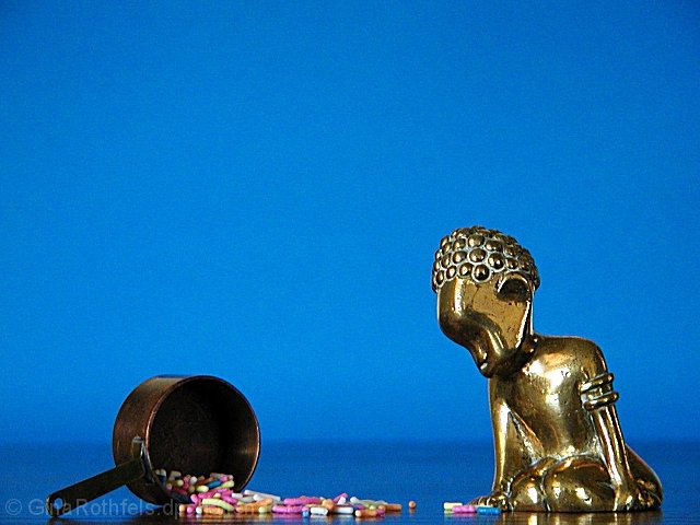
Very interesting, to me it looks like the statue is sitting on the suface of a very calm sea with a cloudless sky in the background. Well done.
Post actions
Nice composition and framing. I like te blue background. karmat
Post actions
Funny, I just had Indian for lunch. Good photo in all respects, except use of neg space is superfluous. 8
Post actions
hee hee, strange and pretty cool
Post actions
Post actions
This one made me laugh. I like the way the statues face looks as it looks down towards the candy. I kinda don't like the two shades of blue. 8
Post actions
very nice :) The blue background sets off the gold toned statue very nicely. Giving 'life' to inanimate objects is intriguing to me... good work :) = 9 - jmsetzler
Post actions
Post actions
Very good subject matter. The colors and contrast are perfect.
Post actions
Composition: 6 Lighting: 6
Post actions
I like this. It seems the little statue is actually looking at the spilled candy. It's in focus and I like the color.
Post actions
Post actions
Wonderful use of colour and composition... (9)
Post actions
Post actions
Post actions
Post actions
I think if you left the statue on the right out this would of had more impact. Just MHO. Good luck. Score 6 Justine
Post actions
Cute. I like the reflections of the sprinkles and the statue in the "floor". The "negative space" here definately brings out the subjects. Really makes them stand out of the photo. The lighting is very nice, and the focus and clarity are good. I like the angle and framing also. Good luck in the challenge. ~Hbunch7187~
Post actions
Very strange! But very creative. Great use of negative space.
Post actions
Maybe a little setup for my taste, but great color. Personally I would've moved the subjects up a bit. I don't think a little less of that lovely blue sky would've been missed.
Post actions
Good!!! Dont eat the pills! Stay away!!!
Post actions
Managed to put a smile on my face. Perhpas there's too much glare on the boy, but overall a nice photo.







 Add photograph to your favorites
 Add photographer to your favorites


