Author Thread Comments Made During the Challenge
Post actions
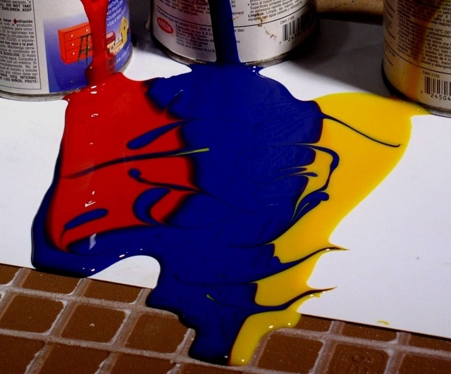
very nice idea, I only wish the bricks wouldn't be showing in the front. 7
Post actions
A sharp focus and better light would make this a killer
Post actions
very cool use of picture & color...i like the blending effect that then rolls onto the brick
Post actions
Good luck getting the paint off the grout. Nice shot, good use of color.
Post actions
the floor part showing at the bottom is really distracting but the paint effect is really cool
Post actions
It would have been better if the backround was all white but still a good shot 7
Post actions
Post actions
Great combination of colors, nice idea and great approach to the challenge
Post actions
Great idea and color. Title is perfect, I would have cropped out the bricks, or taken out the paper all together.
Post actions
Ready to frame "Garage Art"! Nice colours and exposure. M.
Post actions
Great color, composition and contrast.
Post actions
You have tile in your garage?! The white probably should have been extended. The tile actually detracts from the effect. At least to my way of looking at it. Neat interpretation. Best of luck
Post actions
Post actions
Great mess.! The foreground seems a bit grey. A bit more lighting here would probably help
Post actions
Post actions
Post actions
Really like the concept but something about the mixed background (white/tile) bothers me.
Post actions
Creative!!
Post actions
cool colors and concept, but the composition makes this look more like a snap shot, maybe it's just the lighting
Post actions
With a much larger piece of white paper this would be much better.
Post actions
I actually like the way this looks with the primary colors and all its cool...







 Add photograph to your favorites
 Add photographer to your favorites


 Photographer found comment helpful.


