Baudelaire's flirtation with Impressionism was brief but remarkable. They say Manet held the brush for him.
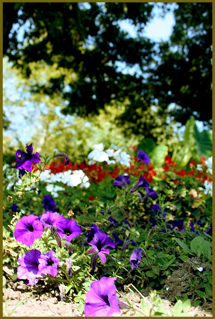
I set the camera to F8 and then put it on the ground in front of these flowers. I didn't know this was Impressionism until I saw the photo later. I used levels to boost the contrast a little. Just a little. Impressionism did not use dramatic contrast. Then I used selective color to add cyan to the whites and yellow to the neutrals, giving me what I felt was an Impressionistic palette. Then sharpness on the lower half to make for some crisp, assertive brush strokes.
The winners will use that technique I saw on DPC where you grab the palette from a painting, but I like doing it the hard way.
Statistics
Place: 175 out of 206 Avg (all users): 4.5840 Avg (commenters): 5.5000 Avg (participants): 4.5342 Avg (non-participants): 4.6538 Views since voting: 1011 Views during voting: 203 Votes: 125 Comments: 6 Favorites: 0
Nice sectioning of color groups moving back through the frame. The bright bit of dirt in the front left distracts a bit, maybe crop out a teeny bit off the bottom? The most impressionistic looking part, to me, is that strip of whites and reds - the background greenery looks almost pontillistic.
A pretty image, Don. Ironically, I think people might've voted this down because it had sharp areas! Good for you for not just applying PS filters to make it look like a painting.
Nice colors, the tree above is almost too dark for the colors below, kinda makes it unbalanced, and also how the top is more blurred than the bottom, would have liked to see some brush strokes or some type of artist effect/filter.





 Add photograph to your favorites
 Add photographer to your favorites

 Photographer found comment helpful.


