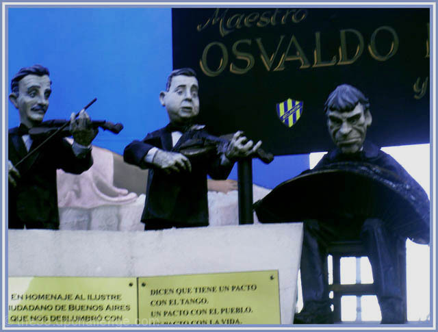
First of all, the image is sort of blurry. If that were fixed, that would majorly help this image. Also, there is a sort of blueish tint to the photo - perhaps the lighting was wierd. I would suggest either trying some adjustments with selective color in photo-shop, or maybe even trying out black and white. Last, the composition is sort of cluttered. The sign in the lower left corner is very distracting! If there had been anyway to get rid of that, and the sign in the background that would help out. Perhaps lifting the camera above the sign might have worked.
Linda composicion e idea, pero le falta FOCO pibe (o piba?) . Ya sea los munhecos o las letras en primer plano deberian estar en foco. Tambien creo que le podias haber dejado el brazo derecho sin amputar al violinista.






 Add photograph to your favorites
 Add photographer to your favorites


 Photographer found comment helpful.


