Author Thread
Post actions
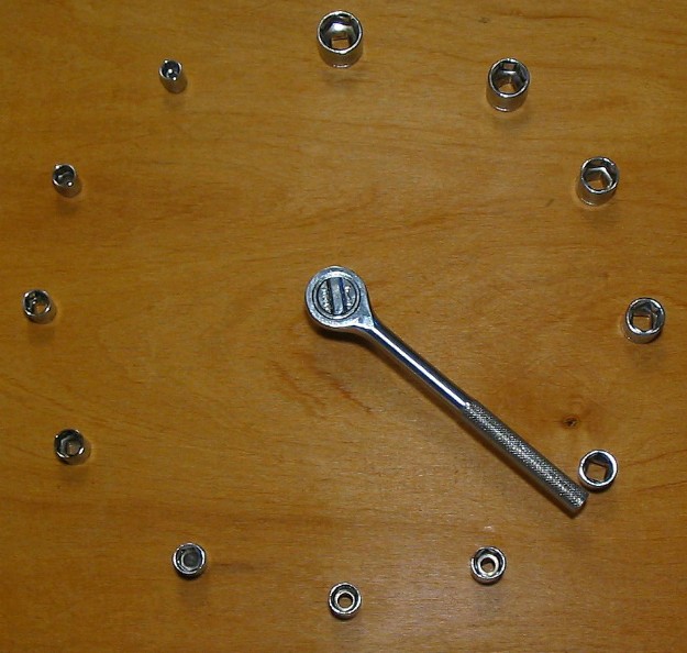
i like this picture a lot, sorry i didn't vote in this challenge... one of the most creative interpretations...
Comments Made During the Challenge
Post actions
nice shot & idea but where's the minute hand? No low score for it missing! 7
Post actions
Nice idea, would have worked better with a solid background in my opinion.
Post actions
This would look better on a solid background without the bright flash spot.
Post actions
great use of sockets. I'll have to make one for real.
Post actions
oh dear another - i liked the other better due to the colours and the name, sorry
Post actions
Post actions
Post actions
there is only one hand on your clock
Post actions
Post actions
Post actions
under lit on the top, too much light on the bottom right. The idea is good, but the subject is too spread out for me.
Post actions
clean, simple and to the point.
Post actions
Cute concept. The glare on the bottom is slightly distracting though.
Post actions
very creative..i never would have thought of this
Post actions
Very nice system. I like how you have them in descending order.
Post actions
Interesting idea. The background (wood) looks a bit pale. Would have liked better lighting to eliminate the soft shadows on the "numbers" or go the other way and make the shadows more pronounced.
Post actions
Wood background was distracting, but, otherwise, good job on a great idea.
Post actions
Very creative shot! A little more symmetry in terms of size when placing the bolts would've helped I think, but overall a very good pic. Good luck.
Post actions
Perhaps too centered and straight on. I might have tried an offset shot with some angle.
Post actions
Nice idea, its 21 minutes, but what hour is it? :)
Post actions
Post actions
Fits the challenge. Lighting seems a little dark to me. I also wish there had been an "hour hand" to appear more clock-like - but that's just a personal opinion. I like the choice of the wood background.
Post actions
Nice idea and approach to the challenge.
Post actions
Post actions
Post actions
great concept... background is a bit dull...stone would have looked nicer






 Add photograph to your favorites
 Add photographer to your favorites

 Photographer found comment helpful.


