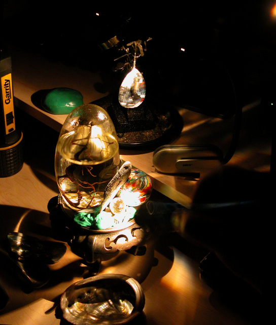
THANK YOU! I really appreciate your comments! More info to consider if you get a moment. The intent of this challenge entry was to see if anybody would comment on the exact lighting & props it took to get this picture in the "Painting With Light" entry: //www.dpchallenge.com/image.php?IMAGE_ID=56754
I probably should have used this picture instead for the Things That Go Together" challenge I took of the props:
//www.dpchallenge.com/image.php?IMAGE_ID=59838
yet the lighting was considerably brighter than I had to use to get the rainbow illuminating the tiny creature… so I chose the dark one which is true to the actual lighting used…. Thanks again for taking the time to comment. I really appreciate it!
Tim Kelly
The message This image defies intellectual analysis, but the warm colors and overall darkness with some spots of light does evoke an emotional response. The feeling it gives me is mostly pleasant but there is an edge of fear; the same feeling I get when I'm about to give a presentation on a subject I'm comfortable with but don't know how it will be accepted.
Creative choices The lighting is what gives this image it's magic, and is mostly done well. The bright spots are perhaps too bright, especially in contrast with the overall low key tone. The composition is definitely cluttered; I think the photo would be just as effective without the flashlight and possibly some other objects. The juxtaposition of sharply and softly focused items is one of the reasons it is difficult to analyze this intellectually, thus a key feature of the image.
Technical aspects With the exception of the burned-out areas, the exposure is good and the tones and colors have been handled well. Focus and overall quality are great.
I like the lighting here, but the composition seems a bit jumbled and random, to me -- which may be the effect you were going for. However, I have difficulty finding what it is you want me "get" from this picture.
Hard to see what's here as it's too dark in most places, and too bright in others. Also, too much clutter and would have preferred more of a close up on just a few items that would have represented the concept you're trying to communicate.







 Add photograph to your favorites
 Add photographer to your favorites


 Photographer found comment helpful.


