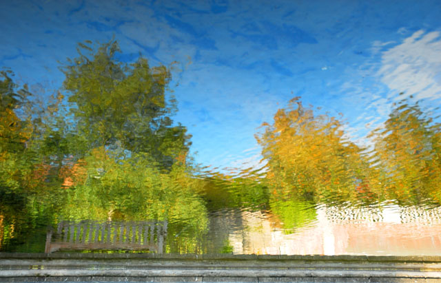
This was a reflection in a pond. I did some saturation, rotated 180 degrees, and cropped off a little bit. I kept the steps into the pond (which are now at the bottom of the picture) because I like how it seems to support the picture.
Statistics
Place: 33 out of 206 Avg (all users): 5.8561 Avg (commenters): 6.8000 Avg (participants): 5.6835 Avg (non-participants): 6.0833 Views since voting: 1059 Views during voting: 223 Votes: 139 Comments: 11 Favorites: 2 (view)
Awesome work! The only thing I can suggest that might have made it a little more interesting is some darkening of the bottom edge of the "bank". It would have added some needed contrast and provided stability. Great job though. - 8
Ah Ha! Love it! This is what I decided to do too. I hope the voters appreciate this approach with the 'natural' impressionism filter of the water reflection. Your colors & depth are much better than I was able to capture though. My favorite by a long shot. -10-






 Add photograph to your favorites
 Add photographer to your favorites

 Photographer found comment helpful.


