Greetings from the Critique Club:
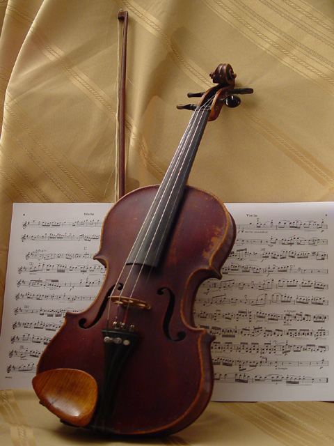
This certainly meets the challenge, in fact you've managed three things that go together and a fourth by implication. The placement of the bow is a little stiff especially with the curve/fold of the backdrop. The other point that stands out for me is that the finish on the violin seems dull, and it is more than a lighting problem I believe. The hot spot on the chin rest is distracting. I notice that many commenters asked for more light and definition on the lower third of the image and that would be helpful in strengthening the whole but I think that the finish of the instrument itself detracts from the image also. The concept was very fine, and with a bit of reworking the image could be absolutely stunning. Thanks for the image.
The photo looks just a little bit too dark for my tastes. Some photos should be dark but I don't feel this one should be. Good subject though. I enjoy the strings myself. Best of luck
Nice composition. Seems like the camera was focused behind the violin. There is a slight shadow which makes me think you were not controlling the lighting as well as you wanted to. This picture has excellent potential.
nice idea. the lighting and focus is better at the top of the instrument.. I'd like to see more of that at the bottom of the image on the sheet music and center of the instrument.
I think this photo should have a darker background (or maybe less light shining on the it) and preferrably a spotlight on the violin for a dramatic effect. Maybe even a rose lying at the bottom to give it some more color and a touch of class. As it is now, this image does not move me.
The backing adds a classy touch to this shot. The sheet's colours balance well with the violin. The music, itself, though is a bit dark. The white of the paper could be brought out more. The right side of the instrument, too, is too dark, indicating a general underexposure in the scene. 5





 Add photograph to your favorites
 Add photographer to your favorites

 Photographer found comment helpful.


