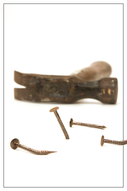
Another high-key entry. These generally don't do so well for me, but I really love the way attention is drawn to the subject with the stark background.
Oh crap. I just noticed the challenge details specifically mention a hammer and nails. I swear I didn't know/remember than when I dreamed up and shot this photo. I like the photo enough to submit anyway, despite my better judgement.
Statistics
Place: 59 out of 164 Avg (all users): 5.6936 Avg (commenters): 7.5833 Avg (participants): 5.4762 Avg (non-participants): 6.0294 Views since voting: 1186 Votes: 173 Comments: 12 Favorites: 0
I very much like the concept of your entry. And you've done an exceptional job of eliminating shadows. But it would have been nice to see a whole lot more of the hammer and to see more in focus. Nevertheless, it was a good try.
great idea and strong composition. great use of dof. i really dig the contrast of natural sepia tones and white background. the border is simple and sharp and the way that one nail goes over the line is smart and adds to the enjoyment of the image. though this is definately an example of futility, the lightness of the presentation makes it accessible. creative, strong, effective. my idea of a perfect 10.
clever take - "things that don't go together". I like the composition except for the out of frame screw. it would have been more visually interesting if it crossed the frame boundary but you could still see the whole thing. as it is, it just looks awkwardly cut off.
This is how I feel when I try to think up original responses to each challenge. It's a shame that one nail is still usable. I really, really like the out-of-the-border nail. 9





 Add photograph to your favorites
 Add photographer to your favorites


