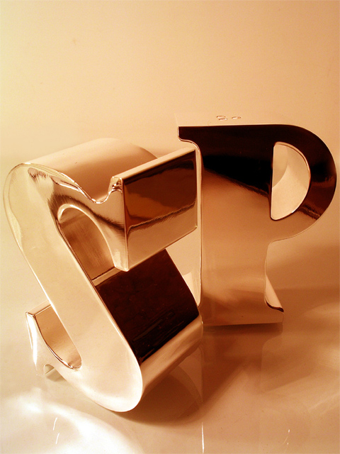
hmm what to say. I like the image a good bit. I like the curves of the S and the straight lines of the P, I like how you have them positioned and how the image is cropped (for the most part, although perhaps it is a little tight and perhaps i would have played with the shape of the image. I wonder how a square cropping would look... but still i think your choice wasn't a bad one). It looks like you have good tones, and good color. The image looks a little hmmm.. well the color seems to be off. perhaps that was your intention, to get sort of a pinky color, but i think it bothers me a bit that the steel isn't shiny silver color and the whites aren't white.
overall good job. Obviously lots of people liked it with a 6+ final score. way to go.
I don't se what the negative space top of frame adds to this shot - your cropping is otherwise so close to the edges of your subjects. After a long look, I actually think it detracts - it serves to remove some interst from the progression of those reflections.
Neat salt and papper shakers. I like the reflections on them and that they do not reveal much of their environment (room photographer etc). The duotone/sepia also works amazingly well.
Very well done ... could be better with out some dark reflections that is there ... hang a white clothe in front of the S & P and it could do the magic.
But clever idea
Give you 8
nicely done, good control over reflections, pleasing composition. minor nit: reflections under P may be accurate but a bit distracting - did you consider removing them?






 Add photograph to your favorites
 Add photographer to your favorites


 Photographer found comment helpful.


