Author Thread Comments Made During the Challenge
Post actions
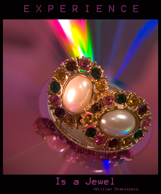
Great picture, nice poster.
Post actions
A little more clarity in the center would have made this shot phenominal. Good job still though.
Post actions
too many colors, hard to focus on.
Post actions
parts of the picture is a bit soft, and the text of the poster is a bit jagged.
Post actions
Great colors! Interesting thought, too.
Post actions
Great color that really jumps out at the viewer. But I think the font was a poor choice for this poster. Your font has a very reserved/technical/computery feel to it. I think a more casual font with some flair would have served better here.
Post actions
I think you could have played with the curves and colors layer some and brought the jewelry out more. It lacks color and pop in the jewelry.
Post actions
Great quote, nice photo, but that font...
Post actions
This is a great idea! Your image seems a bit muddy and un-sharp. Also I would prefer a different typeface, at least for the "Is a Jewel" part.
Post actions
A couple of things let this down; the oof jewel on the bottom and the blocky font. Otherwise, points for spectacular colour and originality!
Post actions
I love the concept and the colorful background!






 Add photograph to your favorites
 Add photographer to your favorites


 Photographer found comment helpful.


