The idea came to me just this morning, hours before the cut off, and it worked out SO MUCH better than I imagined.
I know it's out of the box - but it's VERY Me!
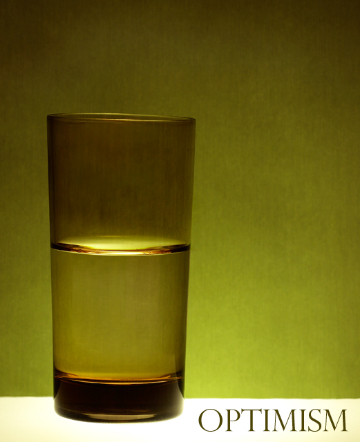
Oh and as a bonus, it's the last remaining glass from a set of six I got from my late Nana as I was setting up my first home, I'm glad it's been photographed so it will live on forever - SMILE!
Statistics
Place: 43 out of 165 Avg (all users): 6.1429 Avg (commenters): 7.8750 Avg (participants): 5.8806 Avg (non-participants): 6.2869 Views since voting: 1638 Views during voting: 334 Votes: 189 Comments: 26 Favorites: 4 (view)
i LOVE this!!! it is simple and beautiful and the color scheme is spot on. I would DEFINITELY put this on my wall. i love the texture in the background too. FANTASTIC!
Looked on your profile page after you sent me a PM and stumbled upon this again - it was my fav in the challenge, so simple, yet the message is crystal clear - excellent work!
Great idea, and its composition and technique makes it unique and interesting, I would hang this up in my office. I like the lack of excessive titular explanation too.
i really liked this one. calm, quiet, simple. very striking indeed. i like the greenish colours as well. the composition is great, and the only niggle i have is that it's just not quite straight.
I have to say that when I saw this I got it straight away.
One of my favourite concepts for the whole of this challenge although if I am being 100% honest I would say that a couple of the techincals did not do it any favours (the slightly off horizontal and the back drop colour)
Still think it is a great shot and congrats on a top 50 finish
How can you call that optimism...that glass is half empty! ;-)
Seriously though, interesting picture for the title, the glass is a bit dark though, maybe better with some back-lighting. (bright glass more optimistic than dark one?)
It's nothing like what an actual motivational poster would be. It's noisy, the colors are strange and blotchy, the layout seems more like something used for a beer ad, yet overall it works. Well at least for me. If the shiny and framed posters belong in offices for white collar folks to look at this one undoubtably belongs stapled on a post for the working man.
color could be a little brighter/more saturated. Besides that, a good simple shot and a clear message that is conveyed. Hope this will hit the front page.





 Add photograph to your favorites
 Add photographer to your favorites

 Photographer found comment helpful.


