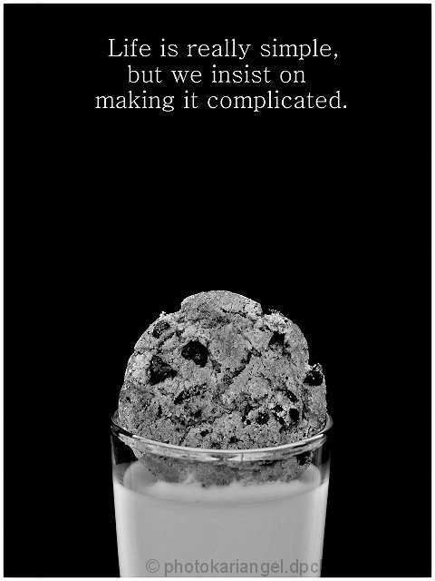
i got inspired today by looking through the "food" gallery here at DPC. Being like most other people in the world, food is good to me. So i went to my kitchen and got an apple, a cookie (ok. i ate like 4 before leaving to do the actual photo, happy?) then poured some milk into a juice glass. Went onto my porch and set up a regular school binder behind the glass so the photo would have some contrast ( was originally in front of a white wall that looked stupid ) anyways, shot 5 shots, and went inside, shot the apple and got the images uploaded. I really didnt plan on even entering this weeks challenges, any of them. But i saw this one and was playing around with it in Mr. Photo Gold ( a super super ghetto version of the poor peoples photoshop, seriously) and found it was very...simple looking. So I thought, "huh, thats like those posters you see" and well, apples to oranges, i got this idea. I dont have a clue on who provided the quote, all i got was annoynomus, so if you know, dont freak out on me because i dont.
not expecting it to fair well though, people dont give cookies the cred they deserve.
Realistic score dream: 5.5xxx
DREAM SCORE: 6
Heres to you, chips ahoy.
Post Challenge:
Well, 5.7 is ok. I didnt really think it would do better then a 5.x anyways. I still like it though. I made an outtake with the title at the top, i like it alot better.
Statistics
Place: 69 out of 165 Avg (all users): 5.7960 Avg (commenters): 6.4000 Avg (participants): 5.6818 Avg (non-participants): 5.8519 Views since voting: 1545 Views during voting: 346 Votes: 201 Comments: 13 Favorites: 0
i really liked the concept of this one a great deal, but I really think the thing that ended up hurting the score was the choice of black and white.
You did a nice job with the converstion to b/w, but motivational posters are usually in color and food type images really scream of good color. By putting it in color, we would be able to find the cookie more appetizing and we would see better contrast between the cookie and the milk. I ended up giving it a 5 because it just missed the mark - in color I easily would have bumped it up to at least a 7.
Also, the milk seems to be slightly underexposed as if the lighting was not even. I saw your outtake and that looked a whole lot better.
Nice idea, but I think the B&W hurts this. Also could use a little more brightness in the milk and a little less negative space between the text and the cookie. (Sorry if I'm making this more complicated :-)
I like the shot, but it conveys another message to me,: shows rather one of the many complications in life (cookie to large/glass too narrow). very good layout, though I had chosen another typeface (typewriter style for example)





 Add photograph to your favorites
 Add photographer to your favorites

 Photographer found comment helpful.


