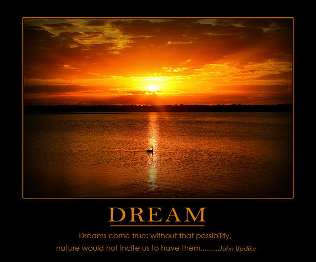
This was one of many shots I took on this particular afternoon. I had just spent the day setting up dozens of cameras, lenses and printers with a rep from Canon. We were both tired but still managed to go and sit out on the cliffs and photograph this sunset. We then went on to have a great meal with the team and three very successful days with the public. We were all exhausted but at least the Canon guy went away with some proof of the beauty that Emerald has to offer.
Above is the small version of the print version.
Due to the copyright uncertainty on the quotation on the entry...I uploaded a printable version for the image to DPC Prints...but with a different quotation. The quotation on the print version is the same as the one on this image.
Statistics
Place: 3 out of 165 Avg (all users): 7.1436 Avg (commenters): 7.8947 Avg (participants): 6.8714 Avg (non-participants): 7.2879 Views since voting: 11931 Views during voting: 426 Votes: 202 Comments: 60 Favorites: 12 (view)
I didn't have much time for DPC lately so I just noticed this pic - very well done and congrets on the ribbon - happy new (jewish) year 2 U and many more ribbons.
We get sunsets here, too, it's only raining today. Well done, nice sunset, with that tiny-creature, maybe represents us, among our vast dreams and possibiilities. Now to make my dreams come true I just have to follow the next 50 motivational posters.
Many times I pick a prominent color out of a photo to use as part of the digital matting and frame.
I was on vacation when I first clicked into the thumbnails and saw this one. I knew immediately: WINNER! I love it when the voters get it so right! CONGRATULATIONS on a perfect motivational poster and ribbon!
This image sucks, it´s way to centered compositionally and it´s too dark, did you check your monitor, most of it´s black? Also your lens seems to suck as well, it vignettes too much apparently!
.
.
.
.
.
.
.
.
.
Just kidding :) Love the shot Judi, I would buy this as a poster, love the sunset and it´s well composed, sometimes the rule of thirds is not the best way to go :) Congrats!
beautiful shot, goes well with the message. don't like the vignetting, though. good choice of color for text and border. font faces and sizes are not too well chosen, layout looks a bit unbalanced





 Dream
Dream Add photograph to your favorites
 Add photographer to your favorites


 Photographer found comment helpful.


