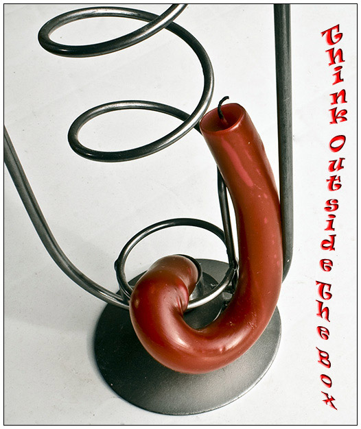
Well I did get this twisted candle from leaving it to much in the sun. It was in perfect context with the candle stand it was in.
I did some basic stuff to the image and added an text. I hope you like it.
Statistics
Place: 126 out of 165 Avg (all users): 5.2079 Avg (commenters): 6.6000 Avg (participants): 5.0270 Avg (non-participants): 5.3125 Views since voting: 876 Views during voting: 359 Votes: 202 Comments: 11 Favorites: 0
Certainly a creative entry. Clever to match the warped font with the warped candle.
The image itself really pulls this poster down. Lot of dirt (or something) on the white background and some shadows here and there which don't flatter the subject.
Overall, I think this is really out of the box so in that sense you presented something that really did present the message you wanted to get across.
interesting take on the challenge, good idea for a visualization of the topic, though the image itself is not too attracting. the typeface really is a crime - I understand that you wanted to play with the shape of the candle and candleholder, but it is hardly readable and has that computer-stoneage-look.





 Add photograph to your favorites
 Add photographer to your favorites

 Photographer found comment helpful.


