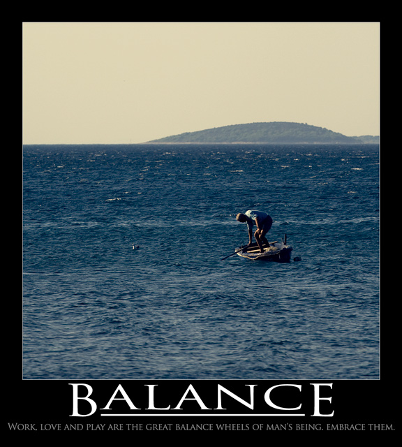
You have all the pieces of a classic 'motivational poster' here. Big image that reinforces the message and a very simple word or phrase presented in a bold manner.
The image itself is probably what kept this shot from scoring 6+. It needs a bit more contrast and some digial wizardry to knock that yellow haze in the sky into something a bit more eye catching. Might also benefit by reducing the size of the image slightly so the text below gets a bit more real estate and can make more of an impact rather than being completely dwarfed by the picture.
I think had you left the 'embrace me' part off the tag line, the layout of the text itself would have looked better (more room on each side's margin). Also, no one wants to embrace work and no poster short of one designed by Goebbel's himself is likely to make them do so - so no real gain by adding that line lol. ;)
good shot, colors just a bit too dull. absolutely shouts "balance"!. the stretched typeface is rather distracting, the bottom line shouldn't be wider than the image.
Great moment well captured. However as the sky is so flat and uninteresting it may have been better to crop almost all of it out, it would have been more impactful.





 Add photograph to your favorites
 Add photographer to your favorites

 Photographer found comment helpful.


