this is totally awesome, not just as a visual pleasure, but the way you've conveyed the message as well .. fantastic combination of imagination, creativity, planning, photographic & photoshop knowledge/ability/expertise .. congratulations on an excellent place in the challenge .. there were some amazing entries .. and of course this is one of them .. :)
Darn! I was sure this was going to be shining its glory at me from the home page! Congratulations on 7th place. This is so professional looking. It truly looks like something one would buy in a store!
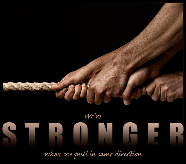
Great composition. The only thing I wish is that the text did not fade like that - especially since it says "stronger". For me it kind of weakens the word.
Good image and header. I like your use of gradient and sans serif font choice. I do wonder how the sub headinggs would look in a thinner sans serif font like optima or maybe century gothic. I'm not sure the cursive font works well with "stronger."
Beautifully designed, gets the message across. I wonder if the fade to black in the large letters isn't just a tad too much, that is, if they maybe shouldn't disappear entirely towards the bottom (my monitor is well calibrated). Also, I think it might read easier if you'd said, "when we pull in the same direction.
This is really superb. The STRONGER word is brilliant in the design. Fontwise, (and I know this is a photography site) I am not a fan of the script font you used, but that's just me. The image is great and I like the line as well 8
Very nice photo and a good idea. All the elements are good just not sure if the negative space works well here. Still it gets a good score from me. Good luck.
Great picture, one of my favorites. I think the font used for the word "stronger" is very appropriate. Maybe it might even look better if for the rest of the text a similar font was used. And maybe not, one would have to try. ;)





 Add photograph to your favorites
 Add photographer to your favorites

 Photographer found comment helpful.


