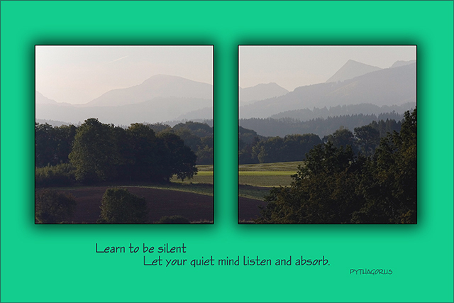
I would get rid of the middle border. Watch the missing letter in the title, it gives it a whole different not so good meaning, at least if spelled leer. I would also make more use of the allowed picture size.
*creeps over quietly to the keyboard, types softly...*
I love that you've made this a diptych. Great landscape and layout colour. Very peaceful indeed. The thing I don't much like is the drop shadow. Probably would have looked much better without it.





 Add photograph to your favorites
 Add photographer to your favorites


