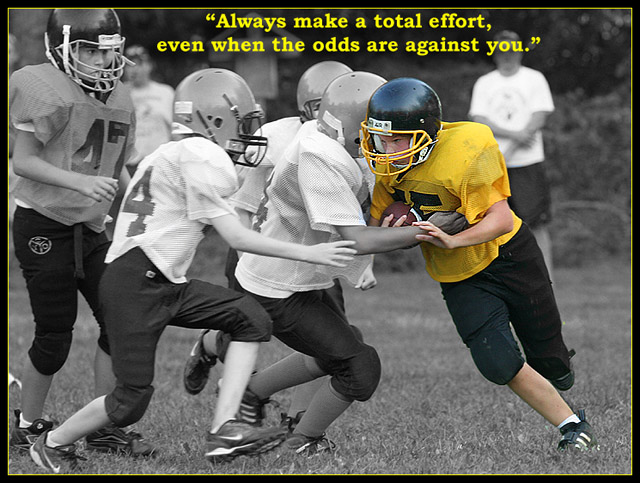
The text seems to be squeezed in there and it looks like you tried to match colors, but couldn't. They kind of collide, which may be why you did it, but for me it doesn't work. I would put the text on the bottom so as not to draw away from the action. Great photo!
good shot, selective desat works well. font and border color is a bit too acidic, text looks crammed between the border and the helmets. Would have made it larger and placed it at the bottom
Very successful poster. I can make a connection between what's being conveyed in the quote and what I see in the image. The selective desat was a good decision too. Bumping up...






 Add photograph to your favorites
 Add photographer to your favorites


 Photographer found comment helpful.


