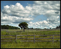
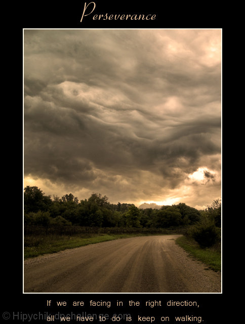
As a stand alone image, this is great and would of scored higher, I agree the text is the issue here. Dang those clouds are great, really liking where your processing is going
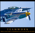
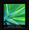
Beautiful photo. Just one suggestion (and it's a nitpicky kind of one) you needed to place your type just a bit further away from the top (and bottom). It gives the impression of being cut off, even though it wasn't.
The photo was a perfect match to the motivational message. And the photo was a beautiful and moody one. Great find.
Fantastic image Terry, I'm not too keen on the spacing of the bottem text but the image in this poster is excellent. Congrats on the great score as well





 Add photograph to your favorites
 Add photographer to your favorites

 Photographer found comment helpful.


