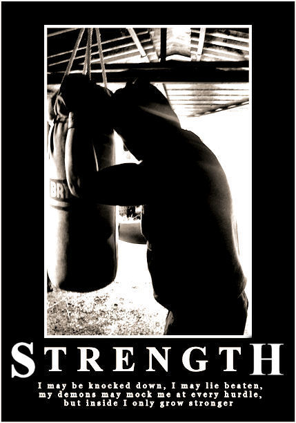
Great pairing of image to message. The message itself looks oddly out of focus. Good choice of font for the Strength part. The long-winded bit beneath the catch word is really the part that has my eye wandering a bit - almost as if the font is too thick or something for such small letters.
Nonetheless, this is a pretty good combination of everything you expect to see in one of these posters. Black and whites don't always find a warm reception here, so that might have been all that kept you from catching a 6 on this. As it is it scored quite well at 5.76 so I think that speaks for itself.
What doesn't kill you makes you stronger. Although I'm also a fan of the alternate sayings, "What doesn't kill you makes you violently ill" and "What doesn't kill you makes you wish it did" :)
Good dramatic photo including an interesting message. The slightly overexposed high contract works extremely well in this case, as does the pensive pose.
Good choice to silhoutte the boxer.
Ties in with the saying, that he's down and beaten, but with the strong bright white light he's 'growing stronger'.





 Add photograph to your favorites
 Add photographer to your favorites

 Photographer found comment helpful.


 Posthumous Blue Ribbon


