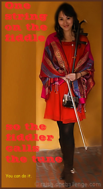
Not a bad shot of her, although her face is a little dark. The font choice is unfortunate, though. And using two different fonts makes it even worse. Yes, this is a photography contest, but when you add text, those choices also come into play.
I think the wording on your photo makes it too busy. I think if you extended the photo on the left, added a border, or just used smaller font, it would have made it less busy.
Not sure what to say really. I don't think the orange/pink font was a good idea, although, I realise you were matching the clothing but it's hard to read over the mustard wall.






 Add photograph to your favorites
 Add photographer to your favorites

 Photographer found comment helpful.


