Critique Club feedback-
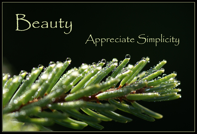
This was such an odd challenge, and the voters seemed to expect a pretty standard type of 'poster'. While this is a nice combination of image and phrase, it doesn't immediately come across as motivational and can be (and likely was) interpreted as just a pleasant platitude on the benefit of appreciating the simple things in the world.
The font and placement of text on the poster also moved away from people's notion of what these posters should look like. There's nothing wrong with it, it's just different and likely different enough to have affected the score. I do think the placement of the words in the frame is ok, and the size change of the font was a good approach.
The photo itself is nicely lit with some good details around the water droplets. A bit deeper focus might have given this a bit more pop as much of the twig is blurred out in prominent areas of the overall poster.
Overall this isn't bad and it picked up a slightly above average score as a result. Good work! |






 Add photograph to your favorites
 Add photographer to your favorites

 Photographer found comment helpful.


